First, the Windows 7 upgrade matrix, table, chart.

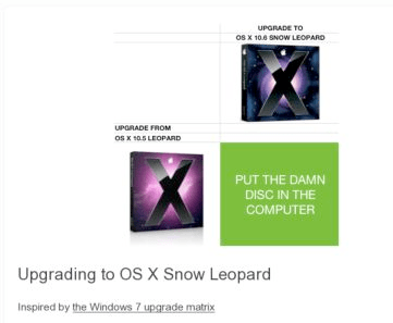
And now, the Mac Snow Leopard Upgrade Chart

Any more Questions???
FATHER + SAILOR + TECHNOLOGIST + MUSICIAN + CYCLIST
First, the Windows 7 upgrade matrix, table, chart.

And now, the Mac Snow Leopard Upgrade Chart

Any more Questions???
Comments are closed.
Yea, you have a point. If only the MAC didn’t cost twice what the PC cost.
Has that changed?
Changed a long time ago…. don’t forget about TCO.
Hasn’t changed… TCO… that’s an argument brought up when facts can’t be found because TCO is for most people very subjective. Show me a JDPower or similar 3rd party analysis that shows a MAC is as cheap to buy and as cheap to own over a four year period.
Four years is my usual upgrade time…
So, where do you see the problem? It’s obvious that you need some sort of chart with so many Windows versions available. How do you imagine possibility of upgrading from 32-bit to 64-bit system? The only difference is Apple’s minimalistic approach – releasing only one version of OS. If OSX was available in 32 and 64 bit, basic, pro and ultra editions you would need the same sort of chart for it.